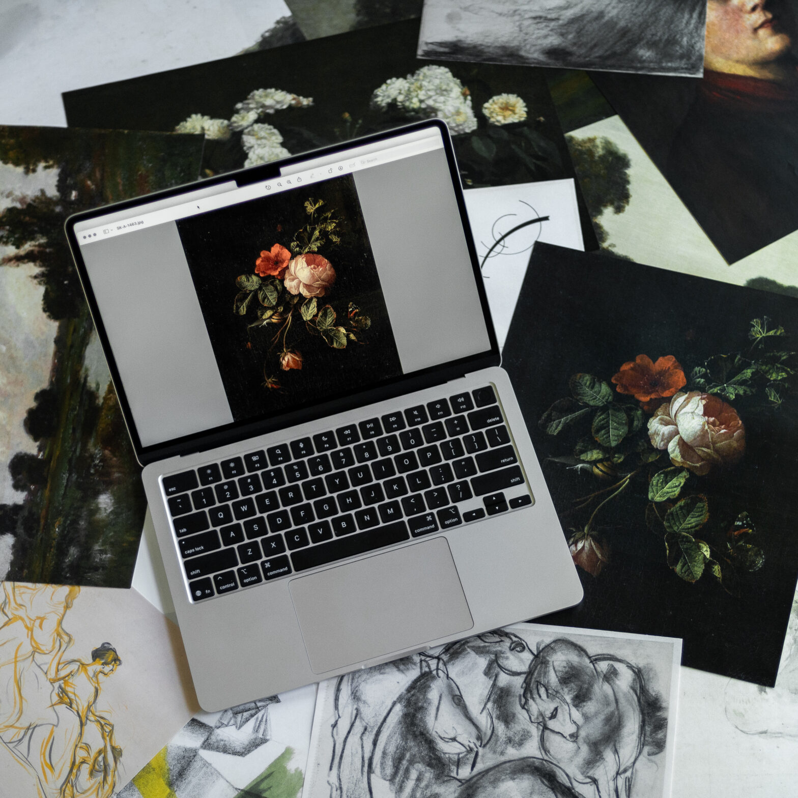
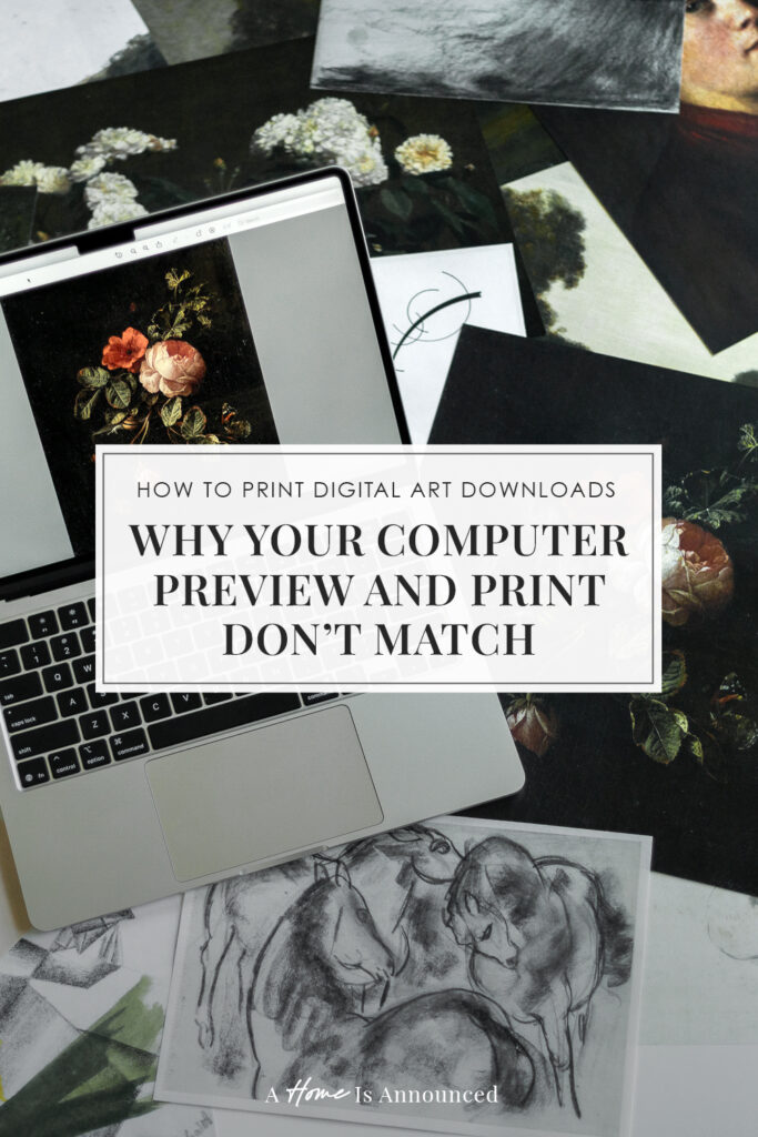
Printing digital art downloads from free public domain art is an amazing way to decorate your home on a budget. But figuring out how to print digital art downloads and get them off your computer and up onto the wall can sometimes be a bit of a headache.
That’s why I’m breaking it all down in this series on the best practices for printing digital art.
In part one of this series I talked about how to know how big you can print your digital art file. Today I want to spend some time breaking down how to get the best quality print from your printable digital art. We’ll cover where to print digital art downloads, why calibration matters, and all the fancy professional printing lingo you need to know so the art you seen on your screen matches the art prints you pay for.
Why Screen & Print Don’t Always Agree
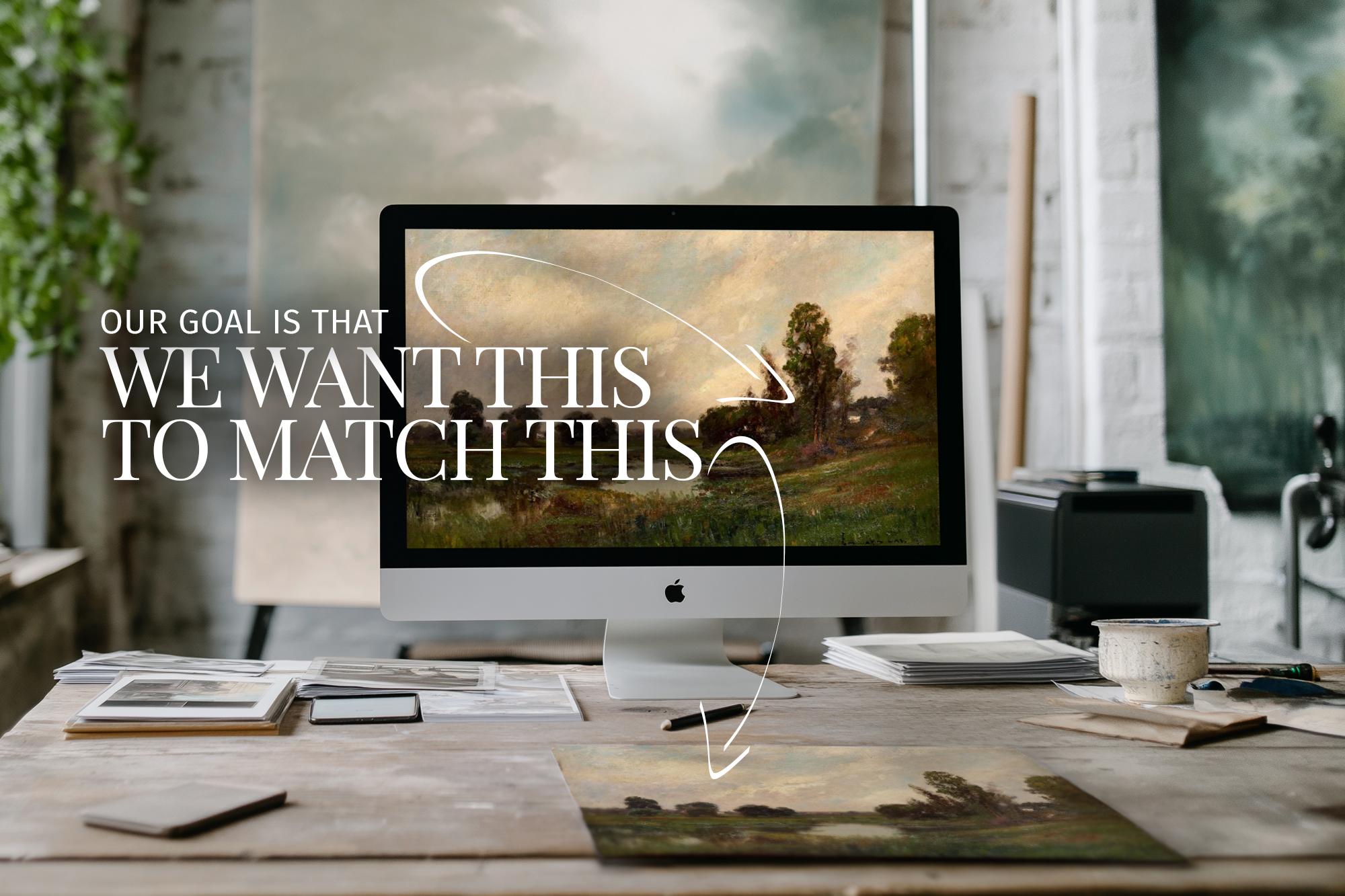
Before we dive into all the nitty gritty technical things we’re going to discuss, one big factor to take into consideration is that what you see on your digital computer monitor or mobile device screen may not be 100% accurate to how a physical print will look.
That’s because digital screens and physical printers interpret color differently. Screens use a digital language called RGB, while printers speak CMYK—a language made of ink, not light. (We’ll break that down in just a sec, promise.)
To get the preview on a digital screen to be accurate to the physical print out produced by a printer, the two devices have to be painstakingly calibrated to one another.
This may seem like something only professional artists need to care about, but it affects even the most casual home printer as well.
Understanding Color Spaces & Profiles
Okay, so here’s where things can start to sound like the college design class you didn’t sign up for—but I promise to keep it short and as headache-free as possible.
RGB vs CMYK: The Two Color Languages You Need To Know
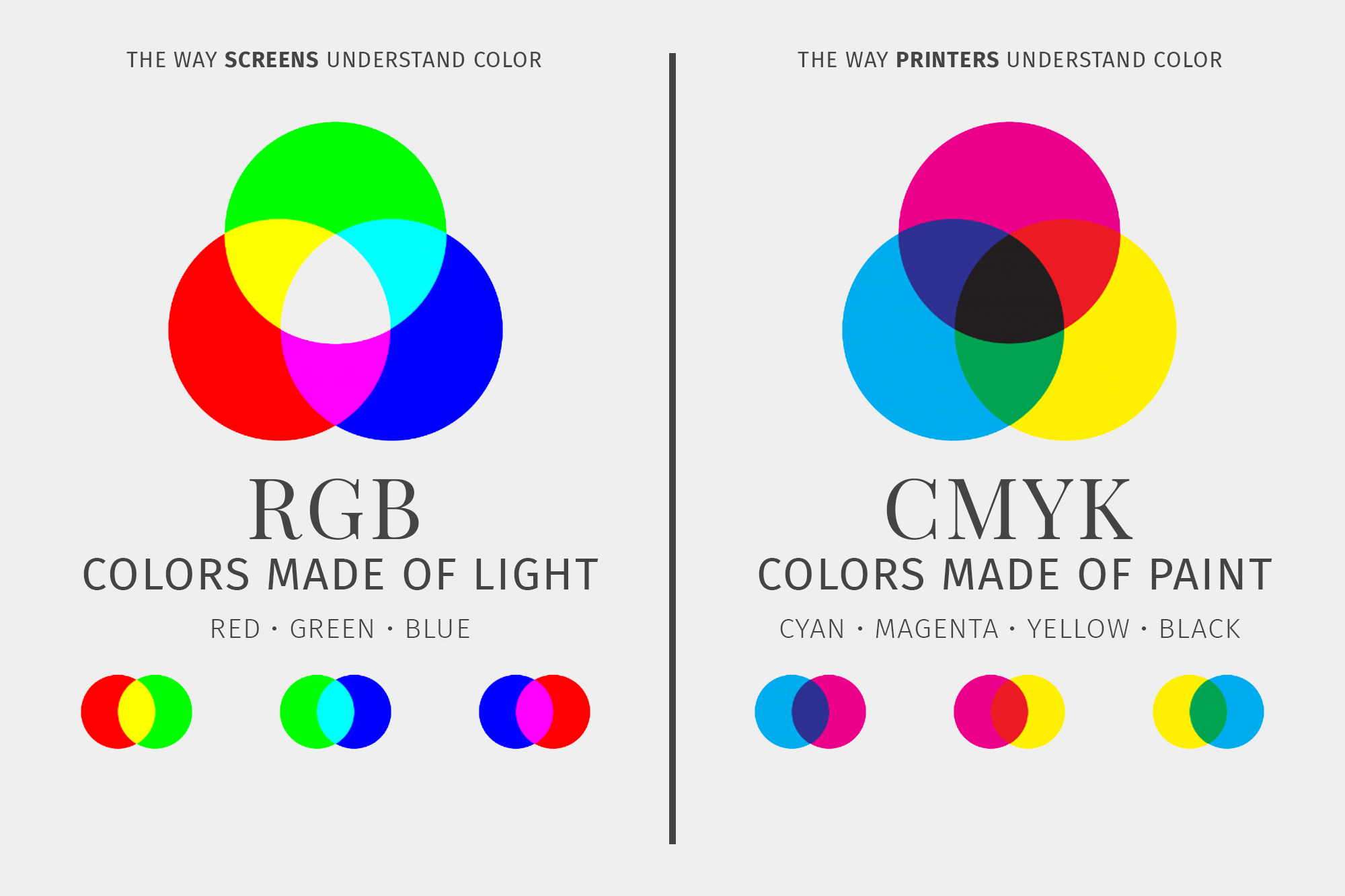
Your digital computer screen uses RGB to understand color. That stands for varying intensities of red, green and blue light and how when mixed together those various mixtures of colored light read as an entire rainbow of different colors to our eyes.
Printers use CMYK to read color. That stands for: cyan, magenta, yellow and black, the 4 different physical colors that ink cartridges mix together in various amounts to create every color under that sun. (And yes I know it doesn’t make sense that K stands for black, it’s an old school thing from when they used to use the word “Key” instead of black because it was the main (aka “key“) color being utilized)
Think of them like distant cousins—related, but definitely not fluent in each other’s language. So when your file makes the leap from screen to paper, some colors can shift. That’s totally normal and there are ways to help prevent any massive changes from occurring.
Color Profiles To The Rescue
A color profile is basically your file’s color translator. It tells the printer, “This is what I meant” and helps translate the color from digital light into physical ink for the printer.
The two main ones you’ll run into are:
- sRGB – Most widely supported (great for home printers + most print services)
- Adobe RGB – Captures more color detail (great for photography, but only some printers understand it, so you’ll want to check with your printer first)
Should You Ever Convert to CMYK?
Usually? No. If you’re printing at home or using an online print service (like Nations Photo Lab, or even your local Staples), you should keep your files in sRGB.
That’s because every printer is a bit different and it’s individual programming will best understand how to process your sRGB file and most accurately represent those colors on that printer.
In other words (if we stick to the language analogy), instead of just translating something from say German into basic English, your printer will translate the German into the exact specific dialect of English your printer speaks so it understands the maximum amount of information.
The exception is if you’re working with a professional print shop and they specifically request CMYK files. In that case, you’d convert your file after editing, right before export, using design software like Photoshop. Just know that some colors (especially bright blues and greens) may shift a bit in the process.
Quick rule of thumb: If someone hasn’t told you to use CMYK, don’t use CMYK.
So if you’re editing in Photoshop, Lightroom, or any other program with export settings, take a second to double-check that color profile box before you hit save.
Monitor Calibration: Is Your Screen Lying To You?
You selected your art, thought it looked perfect on your screen, and hit print—only to end up with something too dark, too washed out, or just… off. If this sounds familiar, your monitor might be the culprit.
Why Calibration Matters
Most screens—especially laptops and tablets—come set to look bright and vivid on purpose. Great for watching Netflix, not so great when you’re trying to print art that actually looks like it does on your monitor.
If your monitor is too bright, your prints might come out darker than expected. If your screen leans cool or warm in tone, that might make your physical print come out looking different than you expected as well.
Try Running The “Brightness Check”
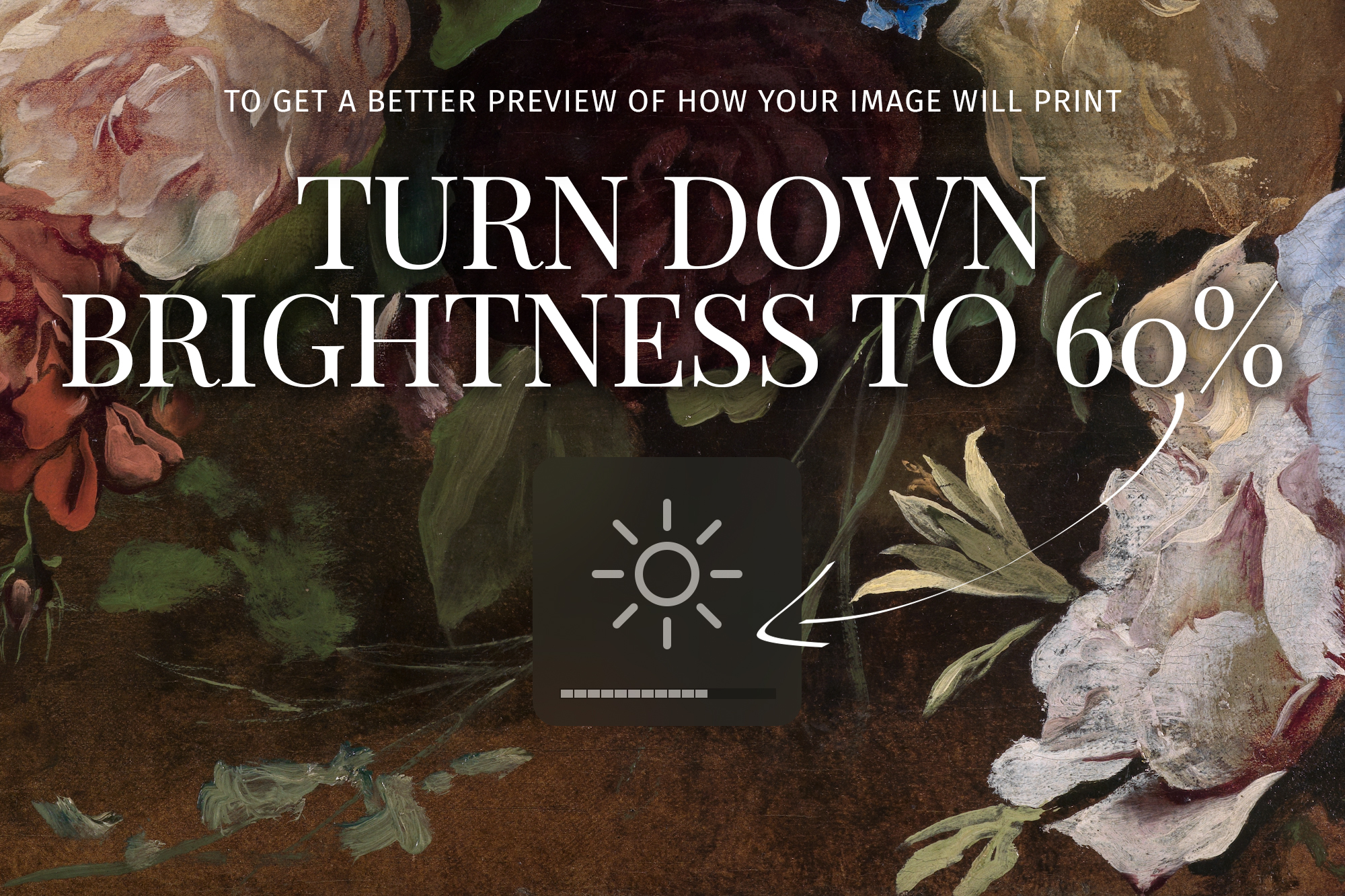
Here’s an easy test you can do to better preview a file before printing:
Open up your digital art file and check the brightness level on your device. If it’s at 100% brightness (especially in a bright room), try turning it down to 50–60% and see how it changes the image. That’s usually closer to how your printer will “see” it.
Preview Your File First At The Print Lab
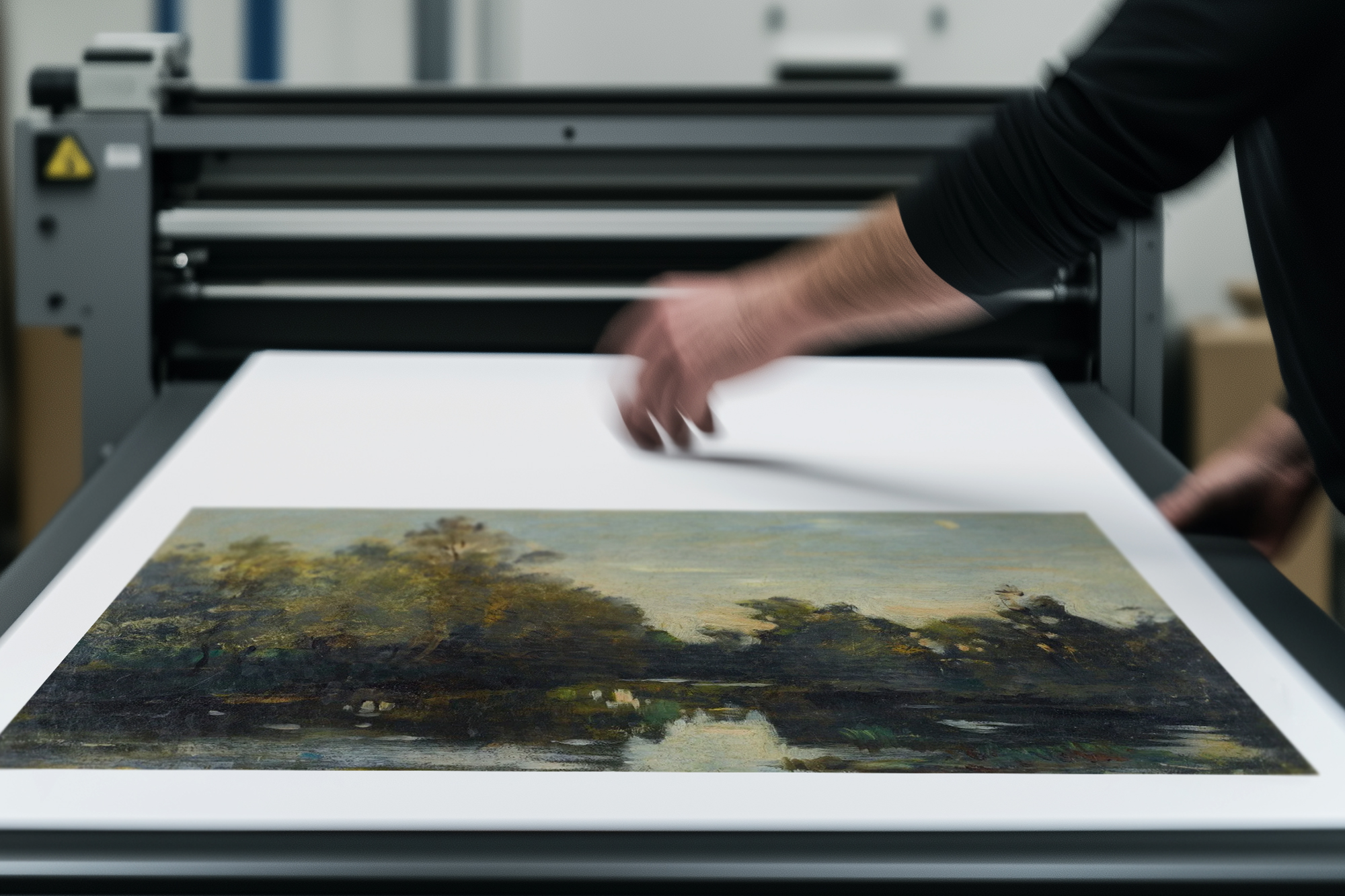
One benefit of using a local printer is that you can often go in and preview the files prior to printing on the print labs computer monitors.
These monitors are typically more precisely calibrated to the printer in their lab and will give you the most accurate preview of what your final print file will look like.
A bonus here is that if the print comes out looking drastically different than it did in the preview on their monitor, often a professional print lab will reprint the file for you for free until it is correct.
Do You Need A Fancy Monitor Calibrator?
Only if you’re doing A LOT of professional printing and are really concerned with getting extremely precise print results. Then you may want to consider picking up a monitor calibration tool like a Datacolor Spyder. These little devices measure your screen’s color accuracy and create a custom color profile to help keep things more accurate when printing.
You likely DO NOT NEED one of these.
These devices are total overkill for most people and they’re not cheap—but depending on your use case, it may be worth the investment for you.
Why Professional Printers Usually Get It Right (and Drugstores… Might Not)
So you’ve calibrated your monitor best you can (or at least turned down the brightness a bit), but your prints still don’t look quite right. The next piece of the puzzle? The printer itself, because not all printers are created equal.
The Problem with Drugstore Photo Labs
Big box stores and drugstore photo centers (think Walmart, Walgreens, CVS) are convenient yes—but not exactly known for their fine-tuned color accuracy. Their machines are often left running for days without recalibration, and staff usually aren’t trained on how to make adjustments or check settings, or really understand anything about the process.
Even worse, most of these photo centers apply an “auto-enhance” filter to all the images they processes, which may help your straight from camera cell phone snap look better, but definitely is not something we want applied to your professional art file.
The result? Prints that are darker, greener, pinker, over saturated, or just generally “off,” even if your starting file was PERFECT.
What Makes a Professional Printer Different?
Professional printing labs regularly calibrate their machines to match color profiles. Many will even provide exact color specs or downloadable profiles you can use when prepping your file.
That means what you see on your (properly calibrated) screen has a much better chance of matching what comes out on paper.
These printers are also professionally trained on how every step of this process works and know how to fix any problem that may arise so that you get the result you are looking for. They can also WARN YOU if a file isn’t suitable for printing BEFORE you pay to print it.
Need a recommendation for what online printer to use? My top choice is Nations Photo Lab! (I’ve also had decent experience with using GotPrint for cheap poster size enlargements).
Home Printing – The Wild West Of Print Options
If you have a decent home printer (that you can actually get to work lol), you might be able to get pretty close to what you see on screen—especially if you’re printing on good paper and using the right settings (more on those in a second).
But home printers vary wildly, will likely limit the size art you are able to print, and most don’t stay perfectly calibrated over time.
If you notice consistent shifts in your prints (like everything looking too blue or too yellow), your printer drivers may need an update, or it might be time for a new ink cartridge, or possibly a new printer all together. If you need some recommendations, these three printers are a great place to start: click to see my picks for best overall printer, best budget printer and best professional level premium option.
Are You Using The Right Settings For Your Home Printer?
Let’s be honest, home printers have a mind of their own, but there are a few settings you can select that will help ensure your printer delivers the best results it’s capable of… maybe… if it likes you that day:
1. Select the Correct Paper Type in Your Printer Settings
- If you’re printing on matte photo paper, select that from the dropdown.
- If you’re using glossy, choose glossy.
- Don’t leave it on the default “plain paper” setting—this affects how much ink the printer uses and how the colors show up.
2. Use the Highest Print Quality Available
- In your print dialog box (where you hit File > Print), look for a “Quality” or “Print Quality” setting.
- Choose High or Best, especially if it’s something you’re planning to frame or gift.
- It will take longer and use more ink, but the detail is worth it.
3. Turn Off Any “Enhancement” or Auto-Correction Features
- Some printers try to auto-adjust your colors or brightness behind the scenes.
- If your prints are coming out too saturated, dull, or contrasty, poke around in the advanced print settings and look for anything called:
- “Image Correction”
- “Photo Fix”
- “Enhance Colors”
- “Auto Brightness”
- Try turning those off and printing again—you might get a much closer match to your original file.
4. Match the Color Profile (if your printer software allows it)
- Some printers let you select a color profile or even import an ICC profile (a file that describes the color characteristics of a specific device, such as a monitor, scanner, or printer) for your paper/ink combo.
- Some professional print papers even offer downloadable profiles for your specific printer model, so it’s worth checking into that as well.
BONUS TIP: Alway Print A Proof File First
This tip has saved my butt so many times and it’s super simple. Always go small before you go big.
By that I mean, before you go all-in on that giant enlargement, print a smaller proof of it first—something small like a 4×6 or 5×7.
This is the easiest way to catch color shifts, exposure issues, or cropping surprises before you spend real money on a giant print that doesn’t turn out how you wanted.
Final Thoughts & The TLDR
How you’re head? Is that headache any better now? Because printing digital art truly isn’t hard once you understand how color spaces work, get a handle on how your monitor brightness may affect the preview images you’re seeing, and choose a printer that actually cares about color accuracy.
TO QUICKLY RECAP: HOW TO GET THE BEST QUALITY PRINT
• Stick with sRGB unless a pro printer says otherwise
• Adjust your monitor brightness down to 60% (100% is not your friend)
• Avoid one-hour photo labs for anything you care about
• Trust professional printers (or your home printer—with a little tweaking)
• Remember to print a small proof file before you spend money on a big enlargement.
Your next step? Choosing your paper wisely—which absolutely deserves its own post. We’ll talk about the difference between archival vs copy paper, acid content (yes, that’s a thing), and why some paper types just make your art look richer.
Until then, happy printing—and may your colors be ever true.
Have questions about about file formats like Jpeg vs TIFF, image resolution or what DPI means? Then head over to part one of this series where I break all that down!
Don’t Forget To Pin This Post & Subscribe!
Want to keep getting more DIY home decor inspiration, thrifting tips & tricks, free art downloads, reading recommendations, and home renovation tutorials? Then don’t forget to pin this post for later so you can follow me on Pinterest and then subscribe to my blog so you can get links to my newest content as soon as it hits the blog!